The tasting experience of spirits, from beginner to professional, has long focused on how sight, scent, and mouthfeel influence the flavor experience of the liquid. Those tasting the spirit are told first to evaluate the spirit’s color and clarity, then “nose” the spirit for distinct aromas, and then pay attention to how the spirit feels in the mouth while processing taste.
A great deal of research exists detailing how viewing the color of a spirit and visually evaluating the liquid’s viscosity in the glass before sipping it will change how the taster experiences and evaluates taste. (There’s a reason part of Glencairn’s brand identity is the use of opaque black glasses for different levels of spirits evaluation!) Even the color of the walls in the tasting room, the tone and intensity of the lighting, and the quality of ambient sounds will impact the customer experience.

Now, we’ll take it two steps deeper into research on haptics, which is how we perceive objects through the sense of touch.
Exploring the Neural Pathways Connecting Taste and Touch
Haptics is driven by the understanding that taste and touch activate the same neural pathways. What comes in contact with our skin connects with and overlaps with how we evaluate certain flavor qualities in our foods and drinks.
Research performed by the University of Twente (Netherlands) found that consumers given crisps (in American English: chips) in a rough-textured serving cup rated the crisps as saltier than when the same crisps were served in a smooth-textured cup. Similarly, research with coffee drinkers found they would rate the acidity and bitterness of their coffee higher when the cup was rough-textured and would rate sweetness and smoothness higher when the cup was smooth-textured. Informal experiences recorded by Chef Jozef Youssef (A Taste of Chivas) found his clients experienced the same drink differently depending on whether it was served in a rounded, smooth, or angular-cut glass.
What’s in our hands impacts what our taste buds communicate to our brains. That’s the first step.
The second step is connecting the visual presentation and perception of texture to the brain’s resulting anticipation of taste. Building on research that indicates visual shapes impact flavor experiences, researchers delved into visual texture—how the graphic representation of texture similarly impacts flavor perception. For example, if a label is printed to look like sand, our visual sense will report “rough texture,” transfer that perception to be processed as if we had actually touched sand on paper, then transfer that perception to be processed as “saltier taste.”
Let’s unpack what that means for spirits packaging.
How Tactile Experiences Shape Taste in High-End Spirits
When we apply haptics, we’re using research that indicates packaging texture prompts the brain to expect certain flavor characteristics from the product, like visual and olfactory cues. Understand these haptics are not universal but are influential. No bottle or label texture will make a bad vodka into a great one. But texture can indeed prompt the taster to rate their vodka as a bit smoother and sweeter when the bottle, labels, and closure all provide “smooth” tactile cues.
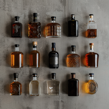
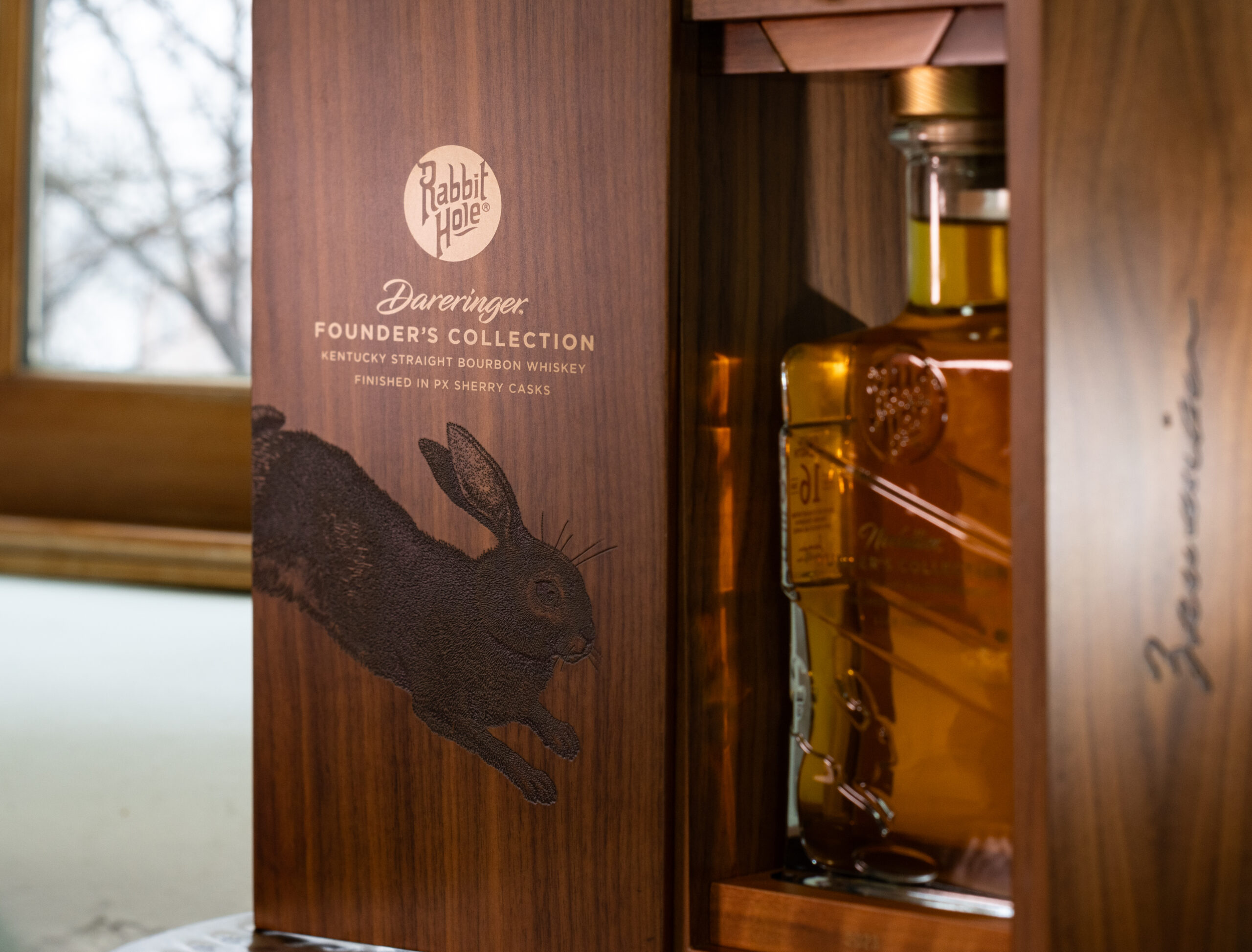
Aside from the obvious texture of the bottle and closure, consider the visual texture of your labels. A label printed to mimic the glow and reflection of glass will cause the taster to expect a different experience than a label printed to mimic the texture of weathered wood. Both may be equally interesting and engaging artistically, but the corresponding artistry of choosing research-based sensory cues should not be ignored when it comes to prepping your consumer for a great-tasting experience.
Keep in mind, too, there is no right or wrong direction when it comes to choosing your packaging. The right/wrong comes from aligning your packaging with your intention. Do you want to promote a smooth, dark spirit to rugged outdoor activity enthusiasts? Caution yourself against falling into a standard aesthetic that communicates “rough around the edges.” Certainly, you can take cues from the aesthetic but build upon the tasting experience you want your consumer to talk about.
Wood accents? Sure—but give preference to the polished wood look and feel. Metal? Absolutely—but the smoothed edges of weathering and patina may fit better than polished edges. Leather? Interesting options—but choose the grain carefully because smooth grain will give your consumer different expectations than pebbled grain.
Transforming Customer Experience with Tactile Brand Packaging
Your spirits brands should be an all-encompassing experience for your consumers and fans, harmonizing what they see, feel, and taste into the pleasurable experience they depend upon you to deliver. We at Spearhead are ready to help you use all the available tools to support your success, with our knowledge and R&D capabilities. Schedule a consultation with an expert today!