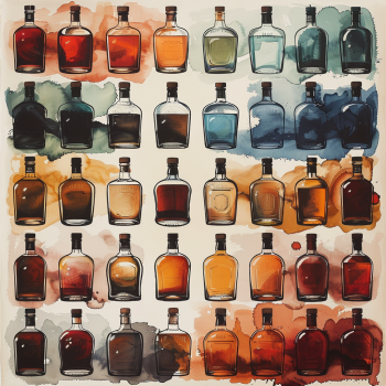
Everyone knows color is a primary sensory element of spirits packaging—so much so that many packaging decisions are made by default because we’re so accustomed to certain industry norms for each target market that we don’t pause to consider options. Whiskey? Warm and deep. Vodka? Chill and clean. You know the pattern.
But we truly need to understand that—while we industry folks are thinking about what the packaging colors say in the language of spirits marketing—the consumer is processing a host of other physical, emotional, and cultural reactions. Your knowledge becomes the advantage when creating a package your target audience will love at first sight.
For example, the emotional reaction to seeing blue is primarily mental—a calming, a quieting of repetitive thought, a reduction in concern. The color green is related to blue and has a related impact—this time physiological. Where blue triggers mental calm, green triggers the physiological reaction of relaxation. Muscle tension eases, and breathing becomes deeper.
Wouldn’t you like to sip this spirit beneath the trees, shading a lovely patio? Wouldn’t that feel great at the end of a stressful day? Just like that deep breath you just took thinking about it?

Subliminally, we know these things when we’re making color decisions for our brand. We use phrases like, “That looks about right,” or perhaps, “That’s a beautiful color combination,” but what we are truly doing is summarizing how the colors, singular and combined, make our minds and bodies feel, from heartbeat to humor, and peace to passion.
From Science to Shelf: A Real-World Example of Color Psychology in Liquor Packaging
Let’s explore the color psychology of product packaging a bit further, using green as an example. Green is easy on the eyes, requiring less work for your brain to process and identify. At its most positive, green evokes assumptions of growth and freshness, health and nature, and prosperity. Depending upon the shade, it can also bring out frowns of envy and illness… or stage the consumer’s expectation that the product will be more exclusive and expensive.
In the context of a liquor store shelf, green is commonly associated with gin—drawing on the color’s connection with the type of natural ingredients used to create the spirit. The consumer expects a bright spirit with which to sip and relax. Even the shade of green will set the consumer’s expectations for the drinking experience, and they will be drawn to color combinations that will match those expectations.
Consider: A consumer wants a new gin to bring to a small outdoor get-together with friends who haven’t gathered for a few months. They expect to relax, catch up on extended family news, and enjoy a simple charcuterie of meats, cheeses, and fruits. Are they more likely to choose the bottle labeled with a bright neon green label, perhaps accented with yellow? Or might they choose the muted fern green label, perhaps accented with gray and silver for their low-key occasion?

Perhaps, though, you want a gin package that is as innovative as the unique spirits recipe you’ve created, one that is ready to be enjoyed at a high-energy celebration. Combining the green shades with colors found in citrus, berries, and flowers—perhaps shift the pink accents from Amaranth to Fandango… Even the name of the shade preps the experience.
But back to green, which is also associated with whiskey—specifically, rye whiskey. Robert Simonson investigated for VinePair the whys behind that common visual marker, setting it apart from the tans, browns, and deep reds used by other categories of whiskey.
Simonson also includes great mention of the rye whiskey’s known flavor profile—a little spicy, a little earthy, and herbaceous, with notes of mint, dill, and thyme. The choice to use green labeling, whether deliberate or accidental initially, subconsciously sets the consumer’s expectation for a whiskey experience, unlike bourbon or Scotch. The visual experience communicates what’s in the bottle and prepares the palate to experience those flavors more intensely.
So now we’ve seen two ways color choice conveys experience and expectations—both for the spirit in the bottle and for the occasion at which the spirit will be enjoyed. When you create a cohesive brand strategy—whether for a singular spirit, an addition to an existing brand line, or the full expansion of a multi-spirit brand—take a bit of extra time to really delve into the potential color palette you’ll use for all your packaging, from bottle to box. Allow yourself to explore the visual experience with new sight, experience how it makes you feel and what it steers you to think.
Now, you’re ready to bring the “spirit” of your spirit to life from the moment your consumer glimpses it on the shelf.
Are you curious about how to design packaging that speaks to your customers’ emotions? Schedule a consultation with a Spearhead Global product developer!
